


Premiership rugby 2024/25 kits ranked
The new seasons kits have been ranked from worst to best

The new Premiership season is set to kick off in less than a month and all the clubs and their fans will be looking to secure the title. Last season was enthralling to say the least with the play-off positions being decided on the final day and Northampton Saints securing their second title, their first since 2014.
The prestige of winning the Premiership title is sought after by each team every season, with only nine clubs ever having the honour.
However, this privilege is nothing compared to winning my judgement on who has the best and most pleasing kit for the 2024-25 season.
So, who will win this distinction?
10. Saracens

(Saracens Men's 24/25 Matchday Short Sleeve Tee, Credit: Saracens club shop)
Starting the list off in last place is the six-time Premiership champions, Saracens. The North London club have decided to dramatically change things up from last year, where the kit was a simple black kit with red stripes near the bottom of the jersey. But the changes have not worked.
Simplicity is always best.
Saracens do this brilliantly at the top of the jersey but around the torso the kit maker Castore must have ran out of black or the bottom of their computer must have suffered from ‘snow’ on the screen and they’re stuck with this, as the bottom of the kit is a mess of black, red and white squares.
The usually imposing name of Saracens is accompanied by an imposing jersey, but this season their opposition will not fear the three time European Cup champions, but laugh in their faces due to the new design.
9. Harlequins

(Harlequins Men's 24/25 Home Shirt, Credit: Harlequins club shop)
This choice and position may be slightly unfair as there is very little Harlequins can do with my dislike of their classic and unique design.
But alas, they can thank Saracens for having such a poor kit design not to be in last place.
The London club moved towards a more traditional four block of colour on the front of the kit, with a design sown into each square, which the club’s website say is to ‘showcase many of the iconic landmarks of our city whilst also celebrating the central role of our local network of community rugby clubs for the first time’.
It is better than the jersey from last year, as the shoulders and sleeves have lessened the green and have decided to go for a bigger block of black, which runs down the armpit and side of the body.
The design is good for Harlequins, but historically the kit has not been a favourite of mine and so it can only fault the original designer of it all the way back in 1866.
8. Leicester Tigers

(Leicester Tigers 24/25 Home Jersey Mens, Credit: Leicester Tigers club shop)
Leicester Tigers unveiled their new kit to their fans at the end of June, and has described the new design as a ‘blend of tradition and modernity united’ by the signature Tiger stripes and bold tiger print.
But it just doesn’t work.
The top colour of light green with darker green through it in a claw mark is not aesthetically pleasing on top of the traditional dark green with its red and white stripes.
The most successful Premiership club are chasing their 12th title this season, which would give them double the championships of the next three clubs in joint second.
New head coach Michael Cheika is renowned for his innovative tactics, maybe he is hopeful the club have employed a ploy of creating an unattractive jersey to blind their opponents and help them in matches.
7. Gloucester

(Gloucester Rugby 24/25 Replica Home Shirt, Credit: Gloucester Rugby club shop)
The first of the two teams to have never lifted the Premiership title enters the list.
Gloucester had a tough season last year finishing ninth and were heartbroken in the Challenge Cup final as they struggled to compete with South African side the Sharks.
The Cherry and Whites kit for the 2024-25 season is incredibly reminiscent of Middlesbrough football jersey’s and usually this would be a great thing as they can be quite pleasing on the eye.
According to the club website they wanted to give this shirt ‘a modern and dynamic design’.
However, it is just boring.
There is hope within the club it would excite on and off the pitch, but there is nothing exciting about the jersey.
There will need to be great rugby played on the pitch to bring excitement to the south west of England as this has not done the trick.
6. Exeter Chiefs

(Exeter Chiefs Men Home Shirt 24/25, Credit: Exeter Chiefs club shop)
The Chiefs seem incapable of being able to make a simple jersey.
The kit would look impeccable if it was solely black with the club crest, jersey maker and sponsor but Exeter have plaster an image of the chief through the side and torso of the shirt.
It is different, but it takes away from what would have been a great design of simplicity had they resisted the urge to clarify with the silver chief that they truly are Exeter Chiefs.
If the 2020 European Cup champions electrify with their free flowing, attacking rugby then nobody will be paying attention to the large head on the jersey.
Fans will be confident they may be lifting a third Premiership title this year, even if they have to stomach Jack Yeandle or Dafydd Jenkins lifting the trophy at the end of the season in this jersey.
5. Northampton Saints
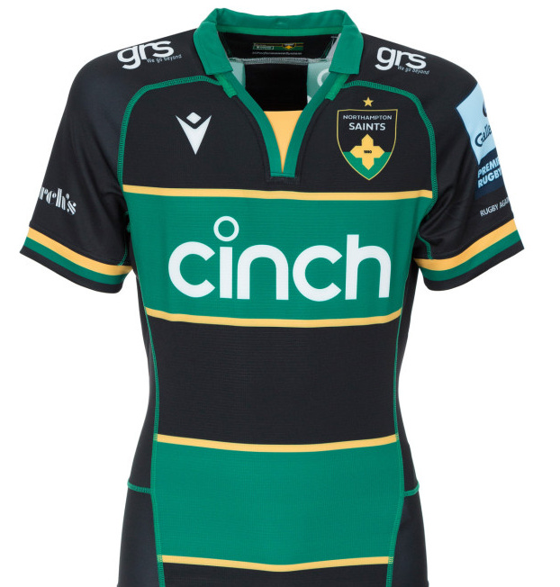
(Northampton Saints Men’s 24/25 Home Kit, Credit: Northampton Saints club shop)
The current Premiership champions have changed very little to the kit this year from the jersey they secured their second title.
The majority of the changes work, the green and black hoops have been thickened along with the collar; the latter has been turned into a v-neck.
The only issue with the jersey is the change of the club crest.
A modern revamp to the traditional crest becoming incredibly simplistic, with just the club colours, its name and the year it was founded (1880).
This is the only issue with the 2000 European Cup winners, who will hope that the slight change to the jersey doesn’t impact their quality on the pitch as they will be chasing further glory this campaign.
4. Bath

(Bath Rugby Men’s 24/25 Home Kit, Credit: Bath Rugby club shop)
Johann van Graan’s side reached the final last season and will be looking to go one further to lift their first Premiership title since 1996.
Bath will be looking to eliminate anything that has held them back from claiming the trophy.
So, the club removed the large white hoop from the home jersey because that was clearly the issue stopping Bath.
The jersey is gorgeous with the large black and blue hoops and a small white hoop to not totally remove the traditional element of the shirt.
Finn Russell will be upset with the removal of the collar, as the Scottish maverick will no longer look as stylish when making his creative plays in the Recreation Ground.
The style of the new Bath jersey, though, is fit for a champion, but will they be able to do it this season?
3. Bristol Bears
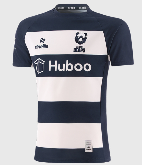
(Bristol Bears Men’s 24/25 kit, Credit: Bristol Bears club shop)
The second club on this list to have never had the honour of lifting the Premiership now enters ranked third.
Bristol Bears have returned to their traditional blue and white hoops to celebrate their 10th anniversary at Ashton Gate, and it is the first time it has been the design since 2018.
The club announced on the website they hope that the return to tradition can bring Pat Lam’s side domestic success.
Lam was the man to crack the code for Connacht to lift their first major trophy in 2016 when they secured the Pro12.
This glory made the squad and the jersey an instant classic for the Irish province, and the same is bound to happen if he can secure a Premiership for the Bears.
A simplistic and classic blue and white hoop look would be a perfect look to be remembered fondly.
2. Newcastle Falcons

(Newcastle Falcons Men’s 24/25 Home Shirt, Credit: Newcastle Falcons club shop)
The jersey that Saracens wished they had.
Reminiscent of the All Blacks jersey, the Falcons faithful will be hopeful this will have the desired effect to improve the team.
A disappointing season last year which saw the club fail to win a single Premiership match, and the club have made a host of changes and signings as a solution, the biggest being the appointment of Steve Diamond as head coach.
The decision to employ a more simplistic look to the jersey could also be key, as opposition may be frightened by the striking similarity to the New Zealand kit that Newcastle may achieve a number of victories and use this to build for the future.
Any Newcastle fan would be proud to walk around the ‘Toon’ in this shirt, particularly with the collar, as this added stylish little tad bit truly makes the jersey look slick.
1. Sale Sharks

(Sale Sharks Men’s 24/25 Home Shirt, Credit: Sale Sharks club shop)
Top of the list is the club based in Manchester.
Sale Sharks have been knocking on the door of Premiership glory for the past few years under Alex Sanderson but have to this point not added to their sole title from 2006.
However, the club are putting everything in place for how to secure the trophy with the kit being the most important.
Last season’s jersey was glorious with the simplicity of the design and the smooth style of the navy blue.
This season's kit has decided to move to a royal blue colour, with a subtle fin design through the jersey to warn their opposition that the sharks are circling but with it being such an artful design it will be too late for opposition to notice and Sale will dominate.
Sale have the perfect kit in place for the club to go on and lift the Premiership, a trophy fit for the winner of this list.